

Detailed Personal Color Analysis Experience Review
Here's my detailed review of my personal color consultation I did when I was in Korea!

I recently went to get my personal color analysis after seeing it all over social media! Apparently it can not only help me understand my skin tone and complexion but help me upgrade my wardrobe and makeup collection too.
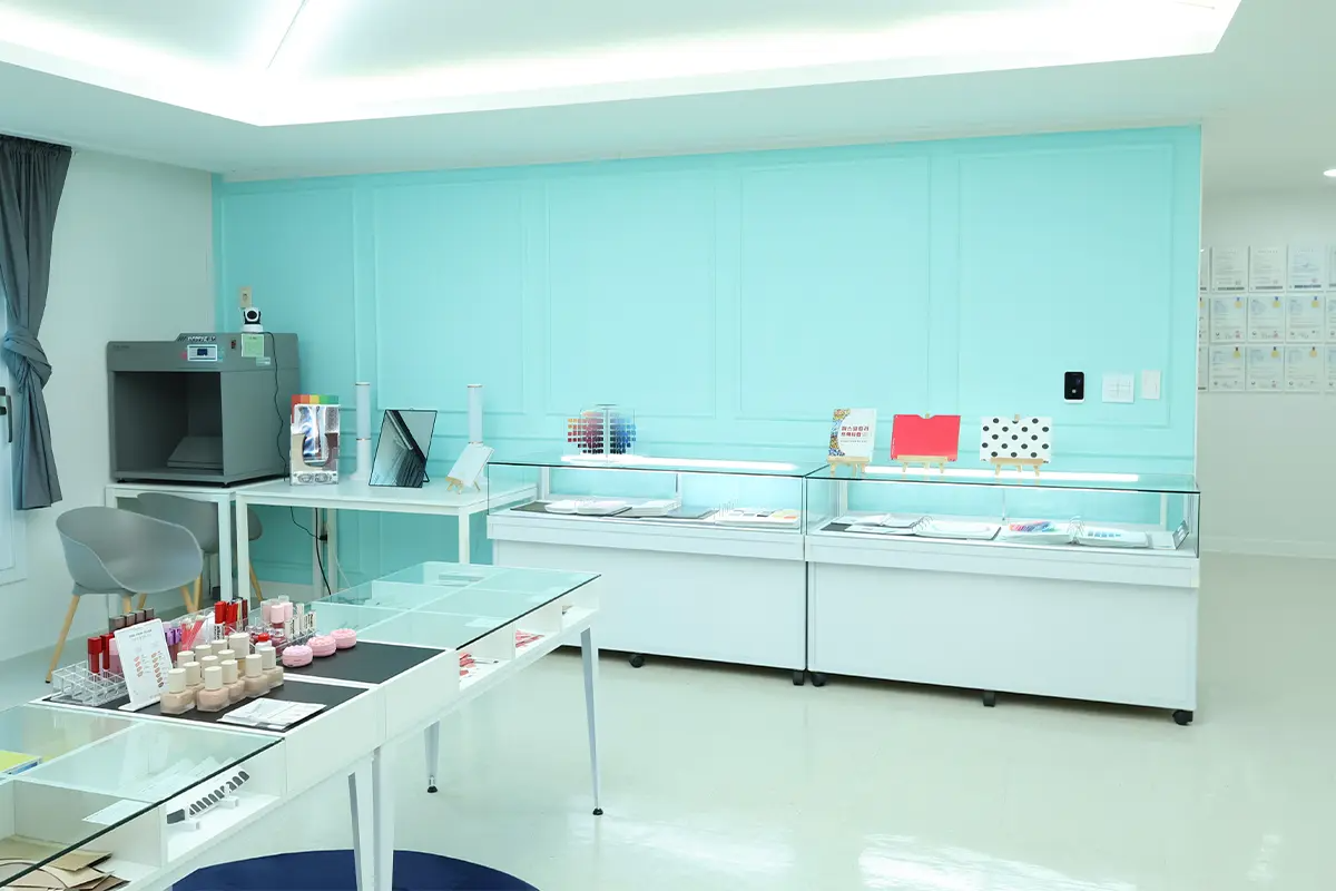
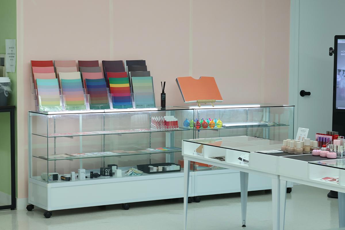
I stopped by the 'Cocory Personal Color Research Institute' in Hongdae to explore my personal color palette. I was struck by how expansive and roomy the interior felt, especially in comparison to other places I've visited.
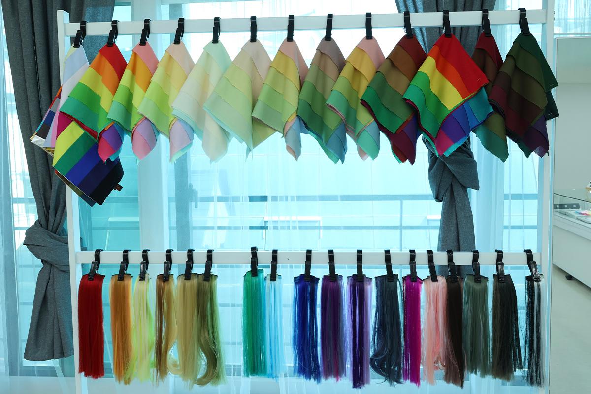
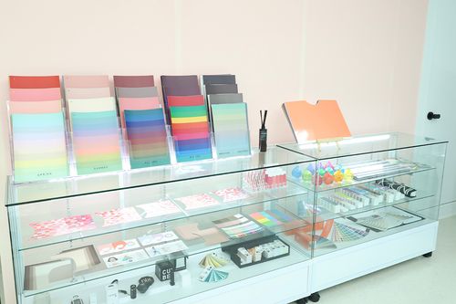
As soon as you walk in, you're greeted by a variety of color-focused products on display. I had a blast exploring the color swatches and chips, pondering the combinations that would work best together.
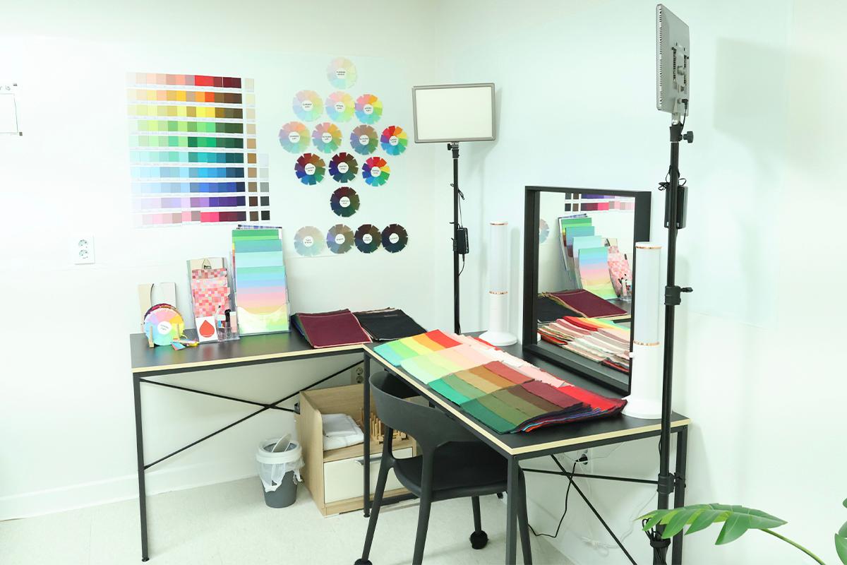
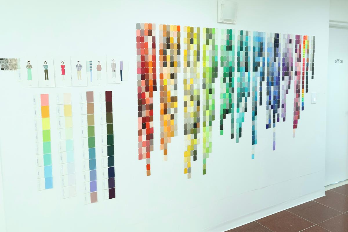
Inside, there's a pristine area with a mirror where personal color diagnostics are conducted. In this space, color swatches are utilized to perform a thorough analysis of your individual palette.
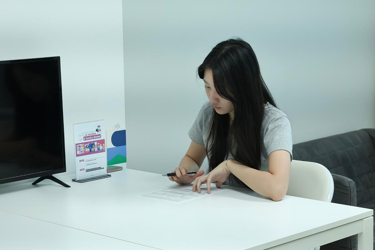

Upon entering the room, you're first asked to jot down some basic personal details on a provided form. I'm set to document everything about my personal color journey today. And there's no need to worry about language barriers; an interpreter will be on hand throughout the session to ensure everything's clear.
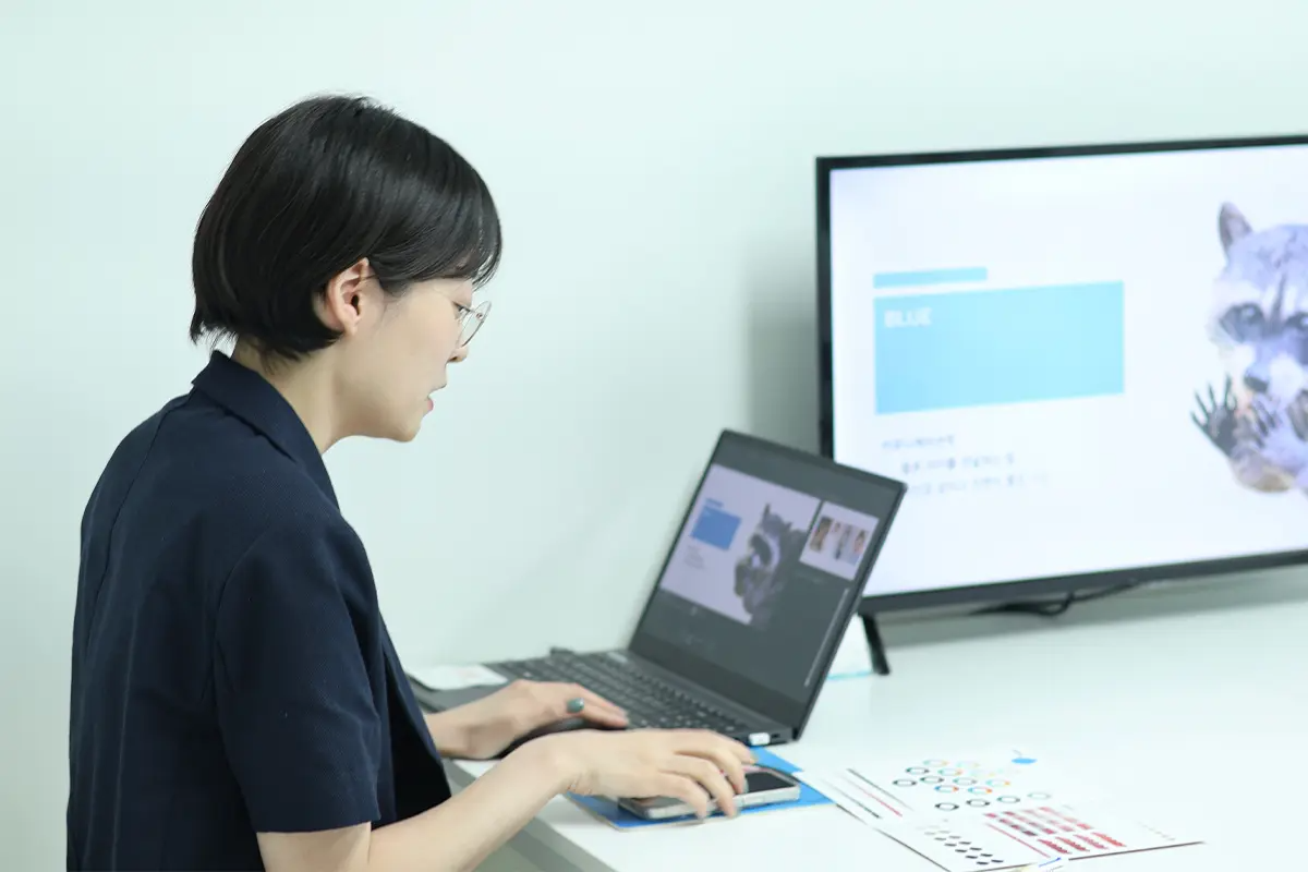
First off, they present an array of colors, inquiring about your personal preference. As it turns out, blue is the color that best matches my character and image. I've been described as confident and pragmatic, and it seems this assessment aligns well with my true personality.
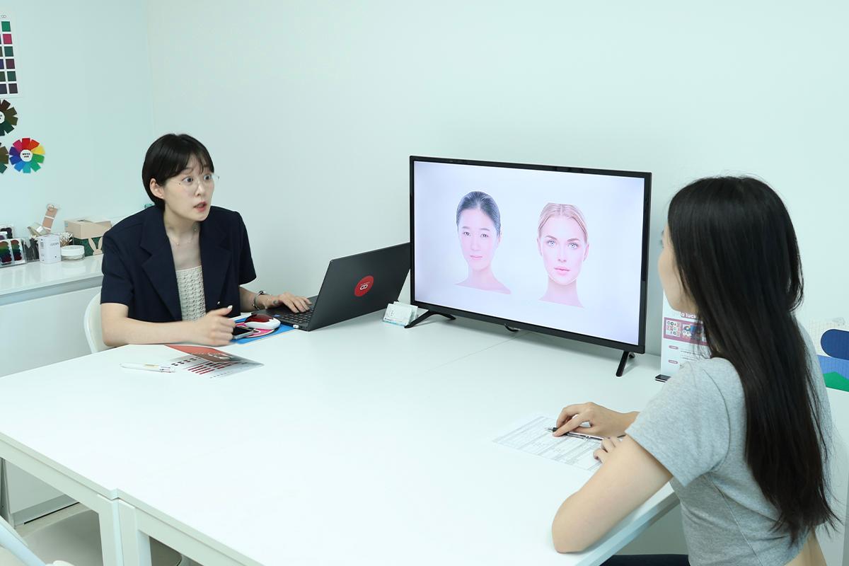
Next, she began with a fundamental rundown about colors to help grasp the concept of personal hues. The division into warm and cool tones was explained in greater detail, and I found it utterly captivating.
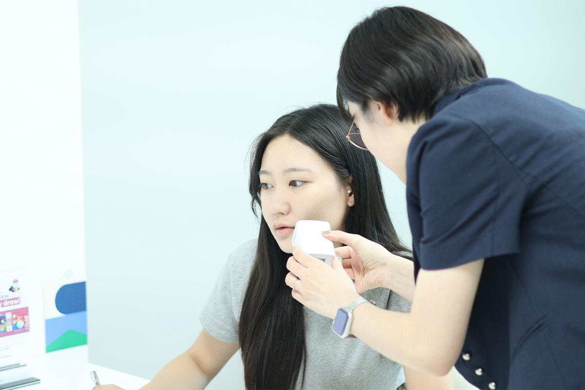
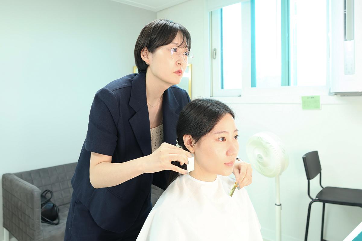
Next, we proceeded with a precise skin color assessment using a specialized device. This process accurately gauged the levels of yellow and red tones, as well as the brightness, in my skin.

It turns out, my skin is fair, characterized more by red undertones than yellow. Typically, this points to having cool-toned skin, but a more detailed diagnosis will follow. Recording these initial findings on paper is helpful, providing a tangible way to reference the results in the future.
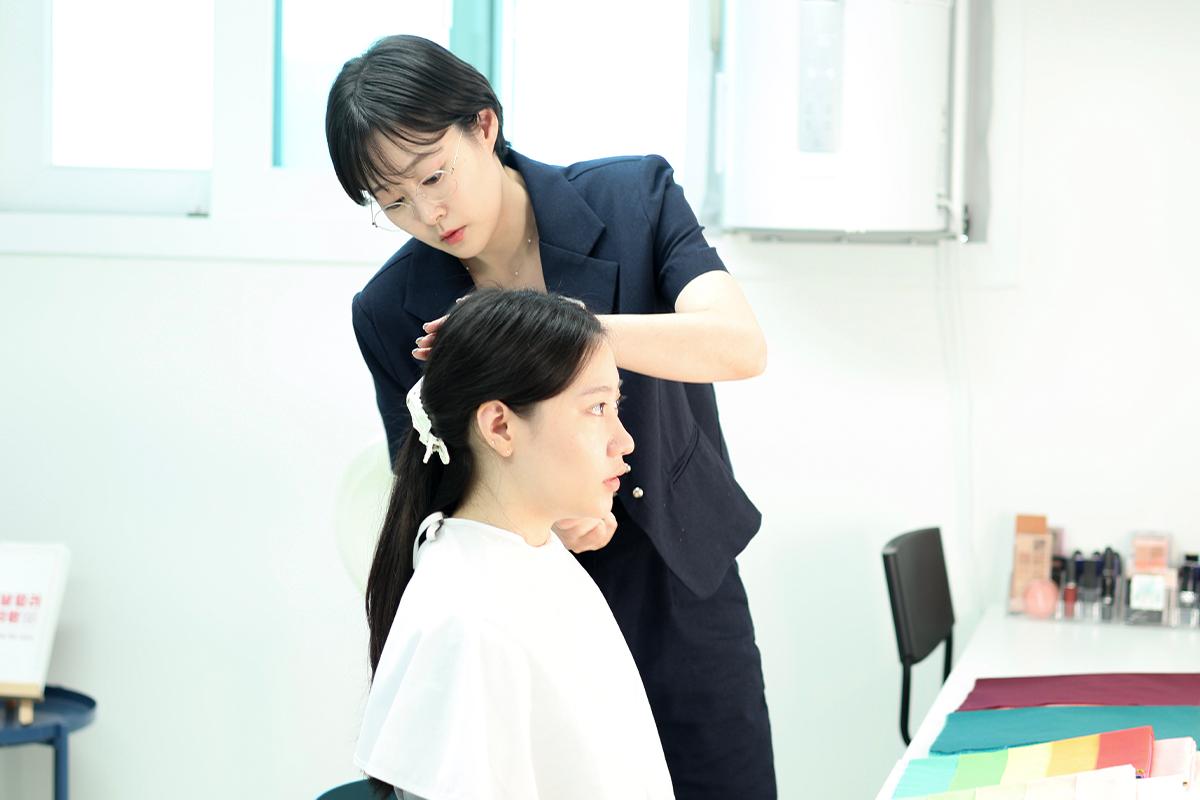
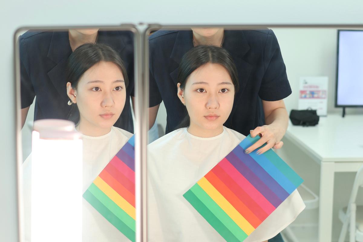
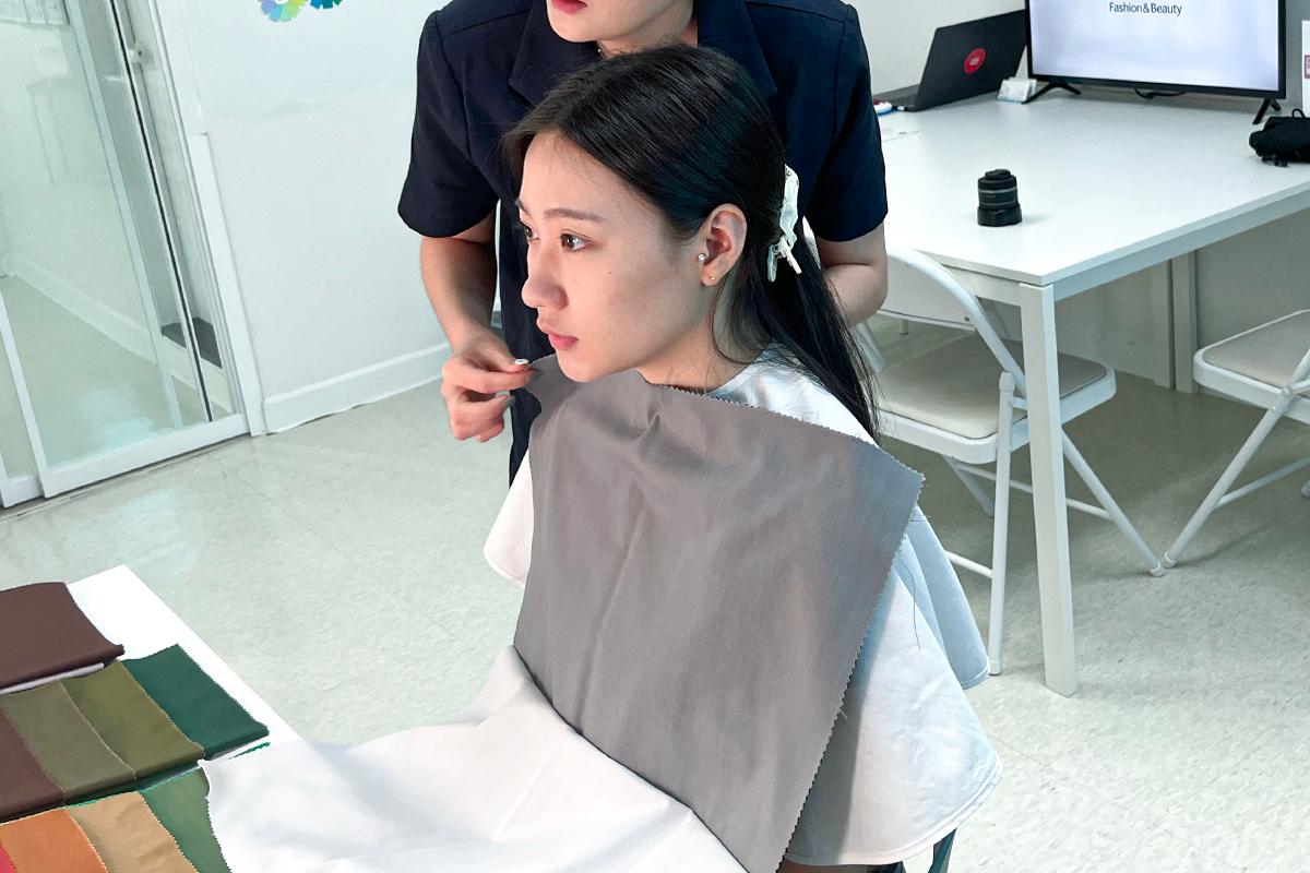
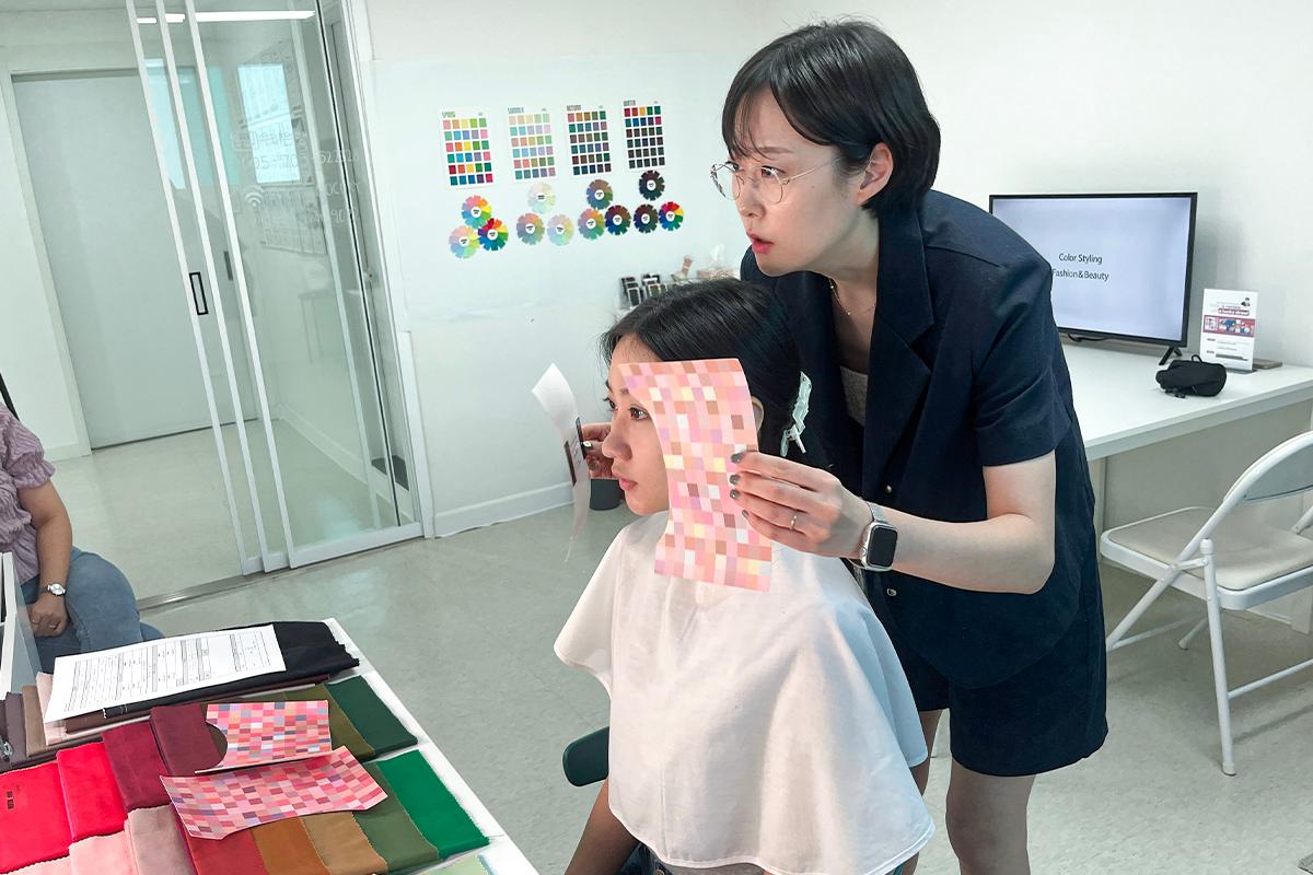
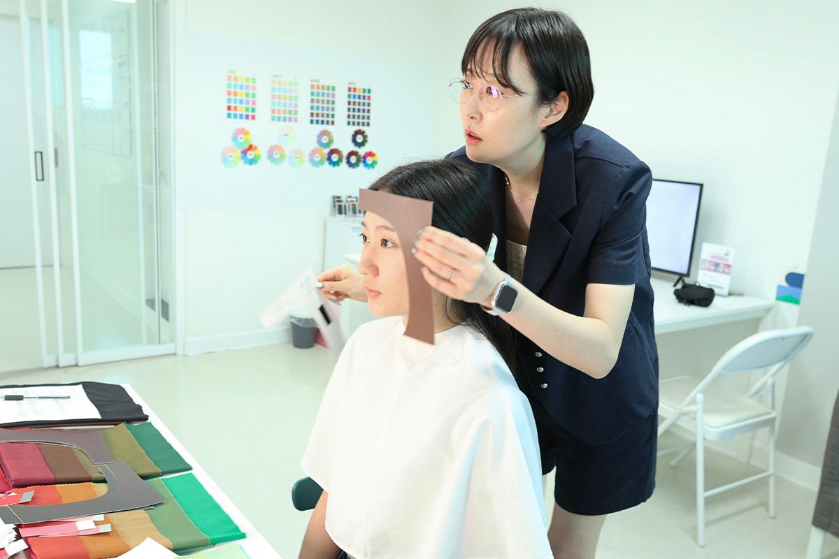
Now it was time to dive into the personal color diagnosis. First, I pulled my hair back neatly to ensure it didn't interfere with the evaluation.
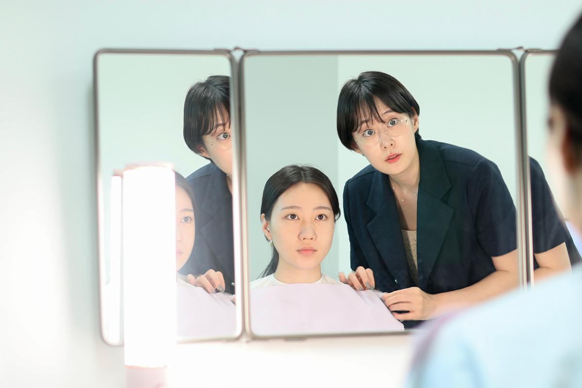
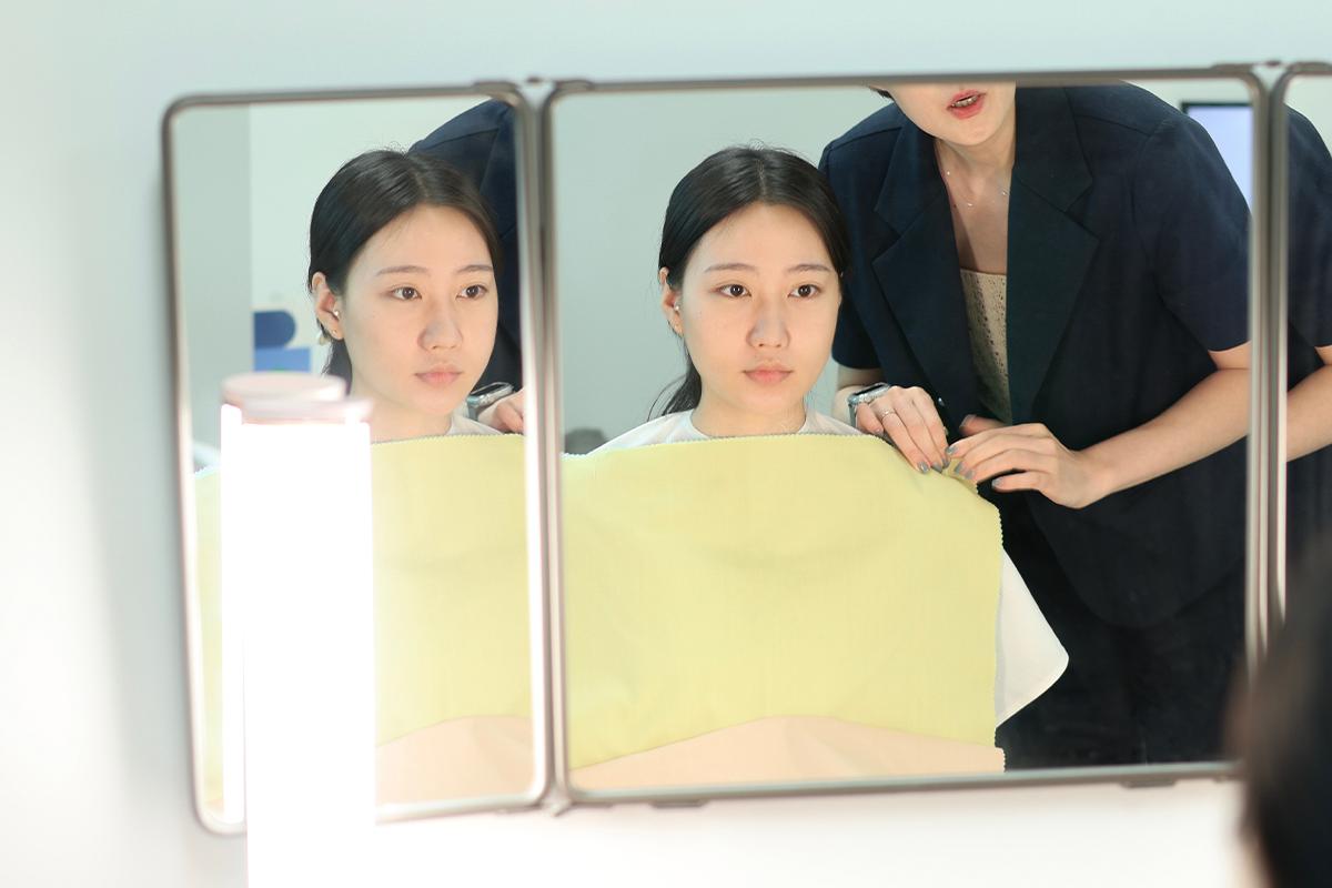
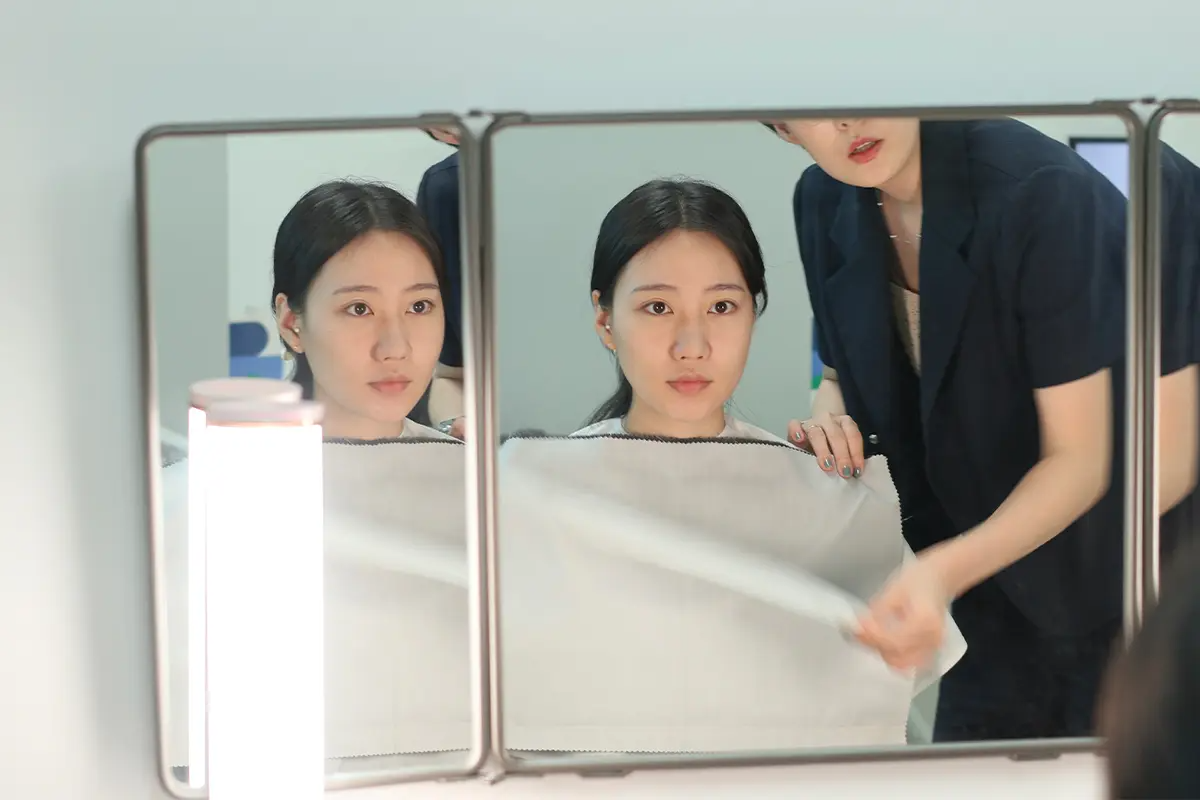
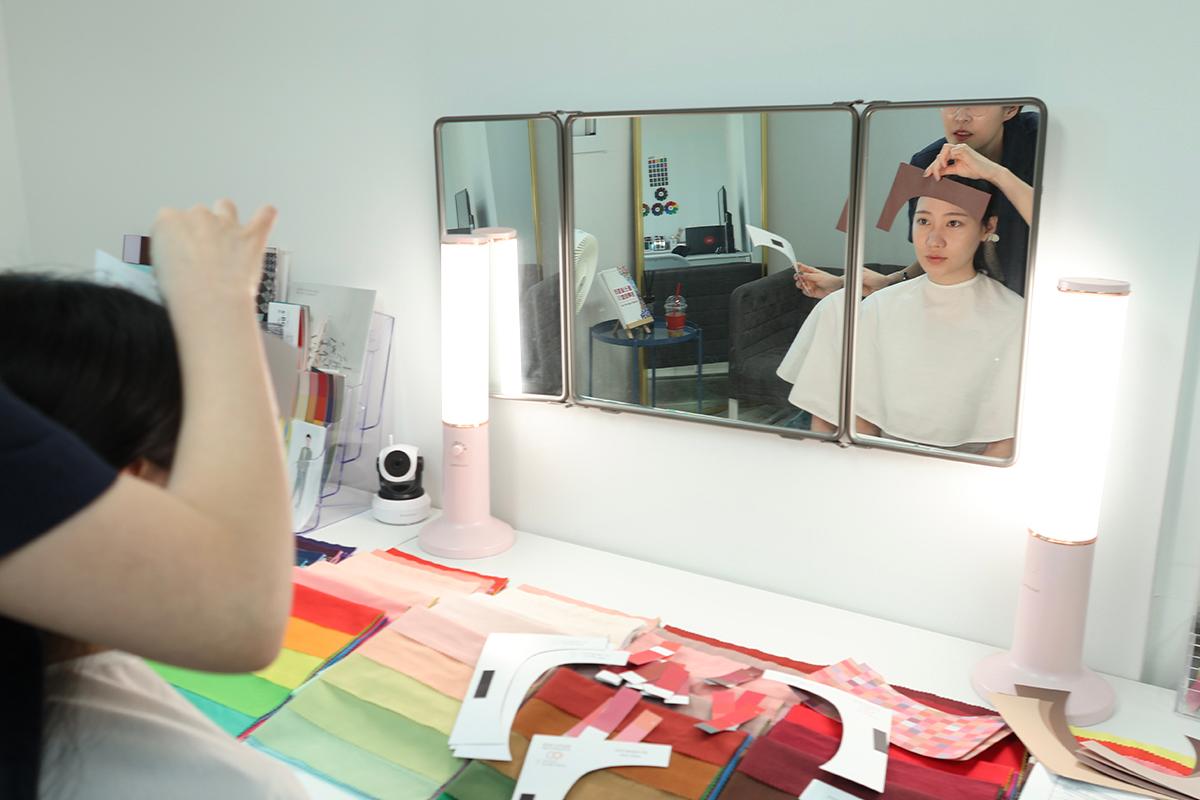
I draped various color fabrics around my shoulders, checking their reflection in the mirror. It was surprising how quickly I could discern which colors were flattering. One trick to seeing if they're a good fit is to concentrate on the color in the center of the face, especially the cheeks.
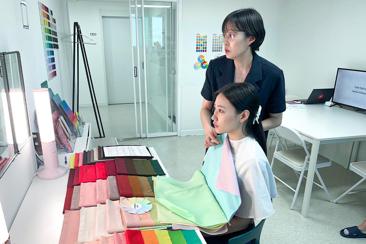
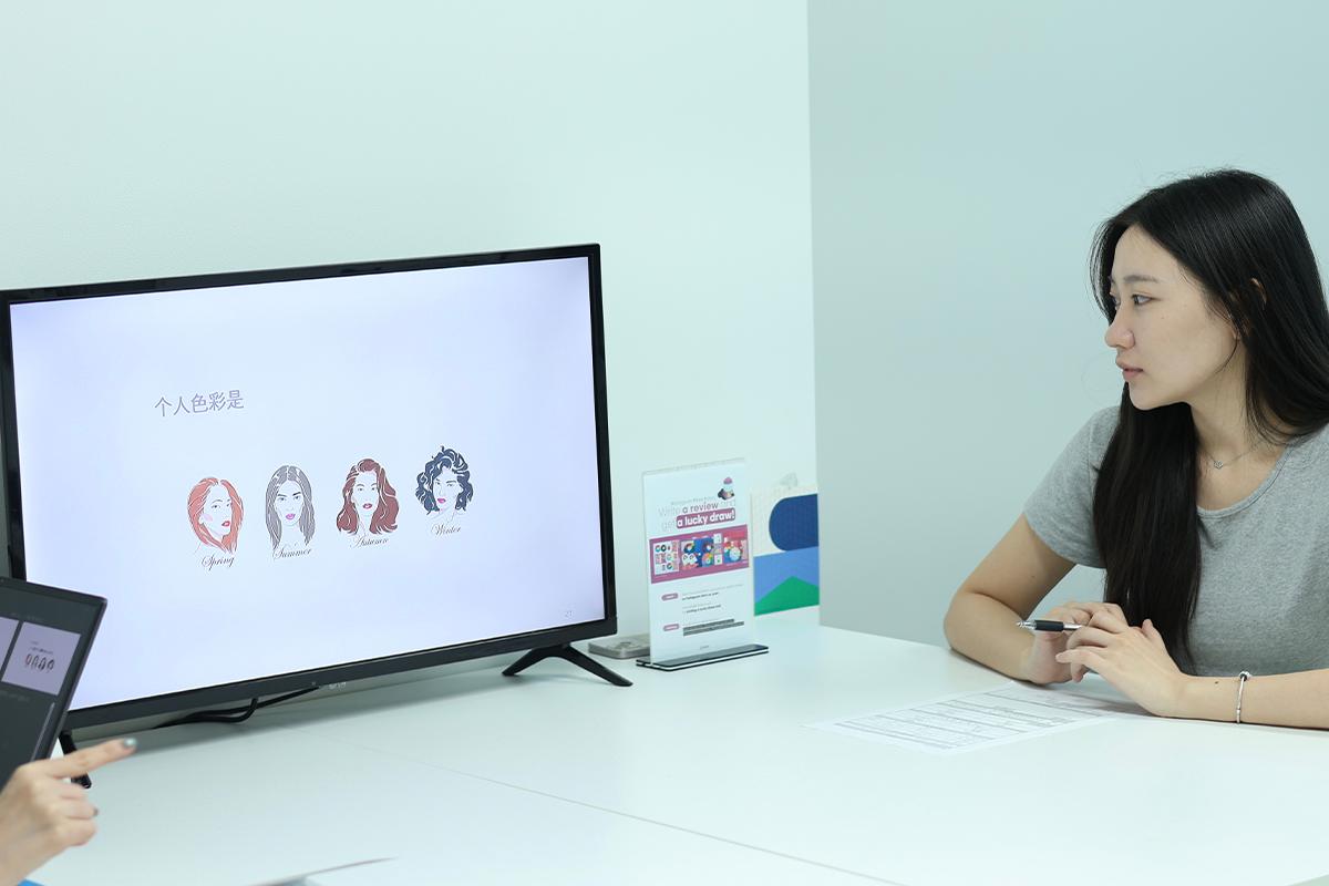
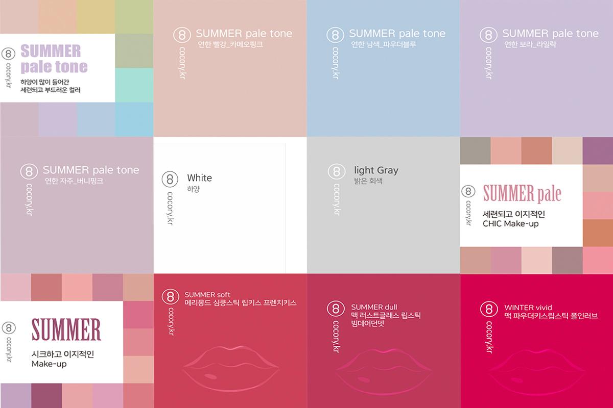
My skin looked more radiant in softer pastel tones than in strong primary colors. The further we went into the diagnosis, the clearer it became — I'm definitely a cool summer tone!
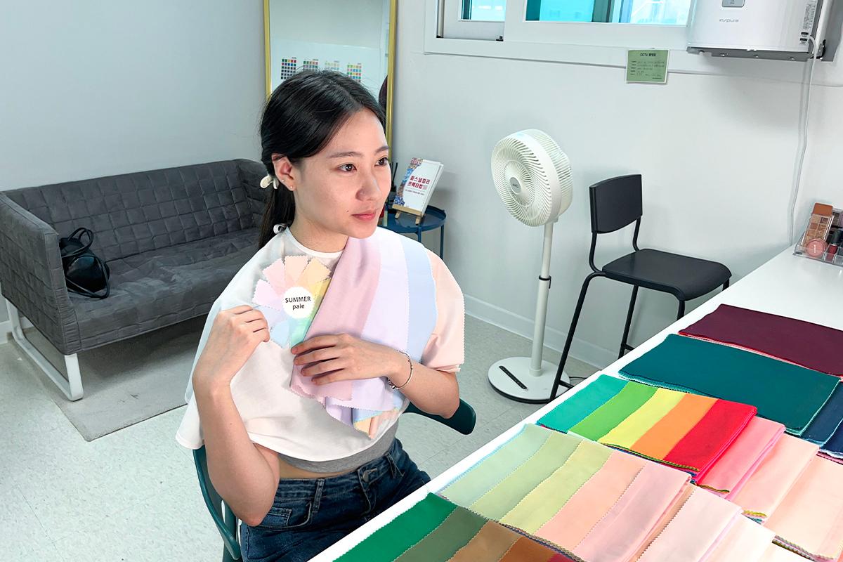
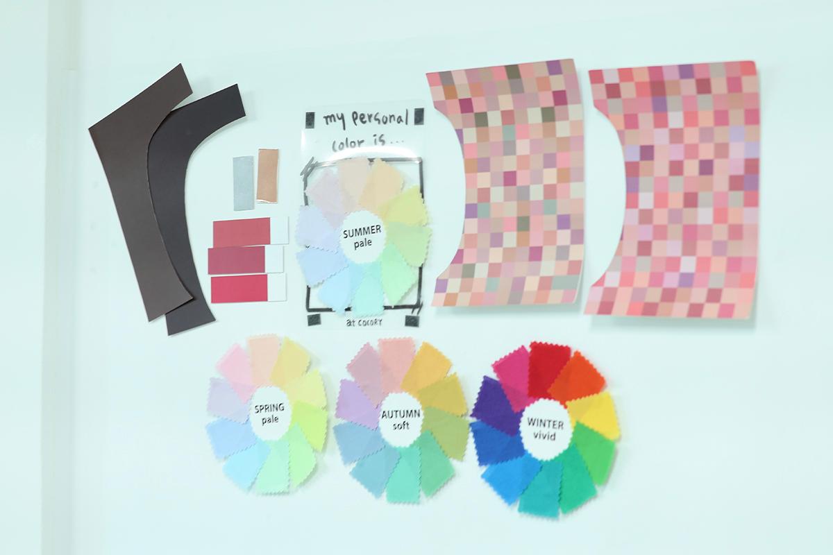
This is my best color. As evident, the pale summer hues with a touch of gray suit me the most. I've always been drawn to this color, so it's a pleasant surprise to see such a perfect match.
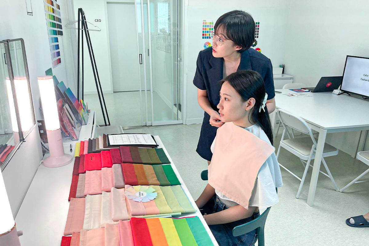
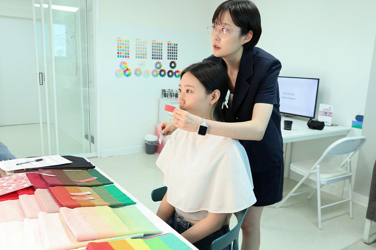
Now, using paper swatches in various shades, you can explore how different tones harmonize with each other. One notable aspect of Coco Lee is their approach: they don't just pinpoint your ideal color, but also guide you on other colors that work well for different occasions. So, even outside my perfect summer pale palette, I discovered colors that would still flatter me.
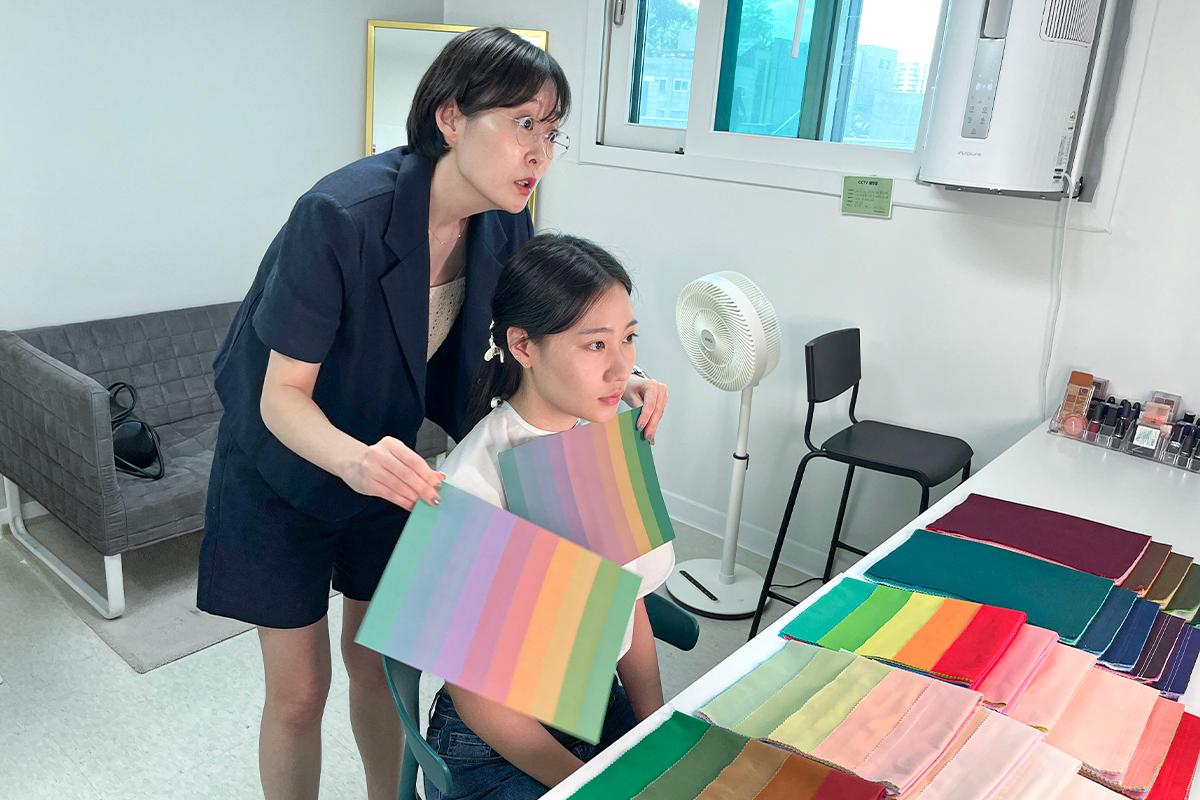
It turns out that not just vibrant hues but also monochromatic shades suit different individuals. For the editor, deeper grays work better than stark extremes like black and white. It seems like it's time to steer clear of those classic black & white ensembles!
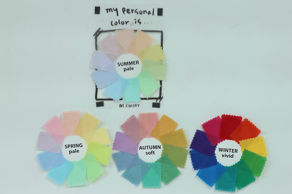
In this manner, you can affix matching colors to the nearby wall. The top choice is summer pale, and while the three beneath it aren't the ultimate best, they're harmonious when used together. It appears that warmer hues prevail over cooler ones, and muted colors are preferable to vivid ones. I was amazed at the depth of insight into my personal color palette, truly an air of professionalism!
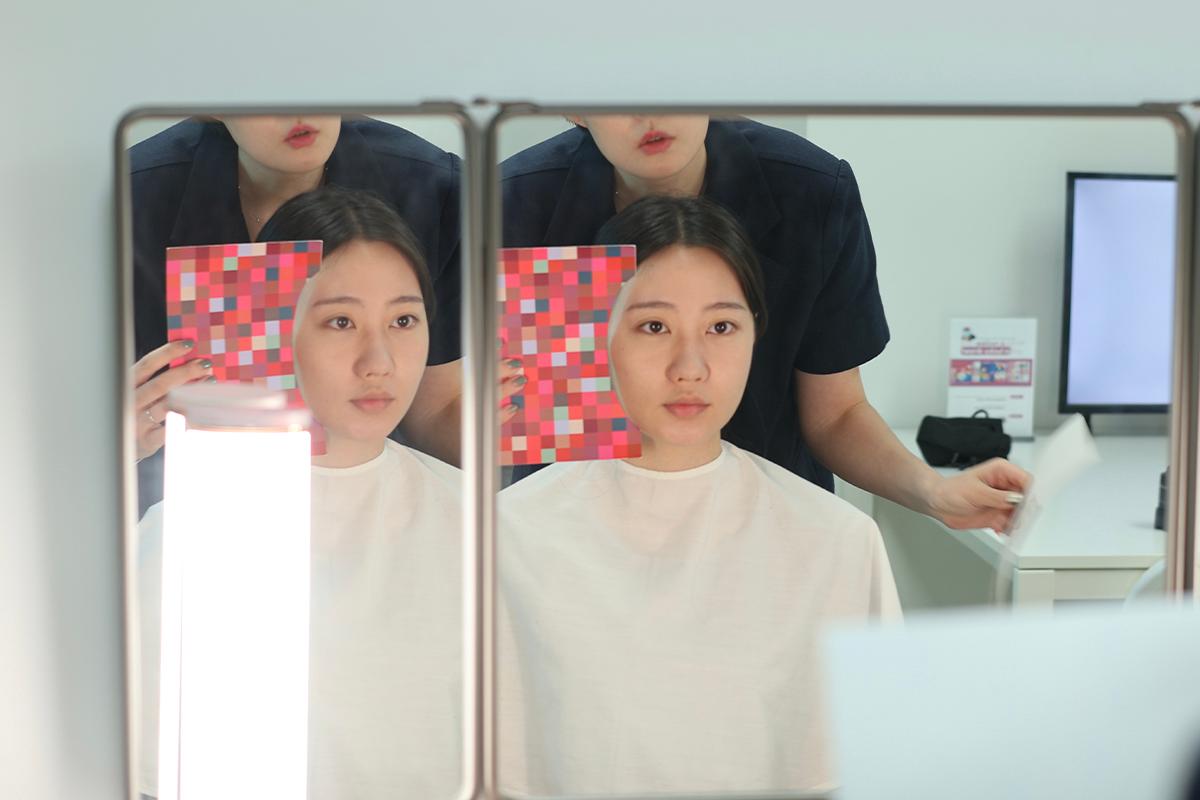
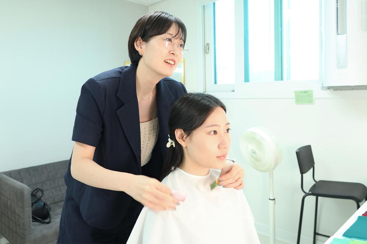
Now, having discerned the colors that complement my attire, it's time to pinpoint the makeup hues that flatter my complexion. Unsurprisingly, subtler shades and softer transitions proved to be the most harmonious.

I also experimented with applying various lip colors directly. While I've always gravitated toward bold, warm tones, I was surprised to discover that cooler, lighter shades actually flatter me more.
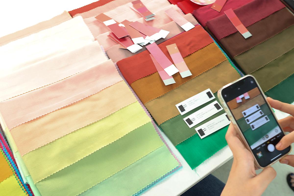
I made sure to note down the specific names of colors that complemented me well. It's a good idea to snap a photo or jot these names down for future reference, ensuring they're not forgotten.
Next up was assessing which accessory colors harmonized with my palette. Generally, gold resonates with those of a warm tone, while silver shines on cooler tones — and indeed, silver was distinctly more flattering on me.
We then explored hair colors, finding that while bright browns made my face seem fuller, darker browns or reds were much more becoming. The subtleties of shade and base color in the same color family can alter the whole vibe, making it crucial to pinpoint the right hues. I now have a valuable reference for future hair coloring endeavors!
By the end of the session, I had delved deeply into the colors that suit me best — from clothing to makeup, accessories, and hair. The comprehensive insights gained were incredibly enlightening
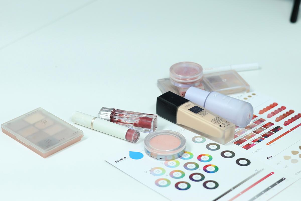
I also had the chance to review my current cosmetic collection. Bringing your go-to makeup is recommended; I learned, for instance, that the purple base I used to counteract yellow tones was less suited to my redder undertones than a green base would be.
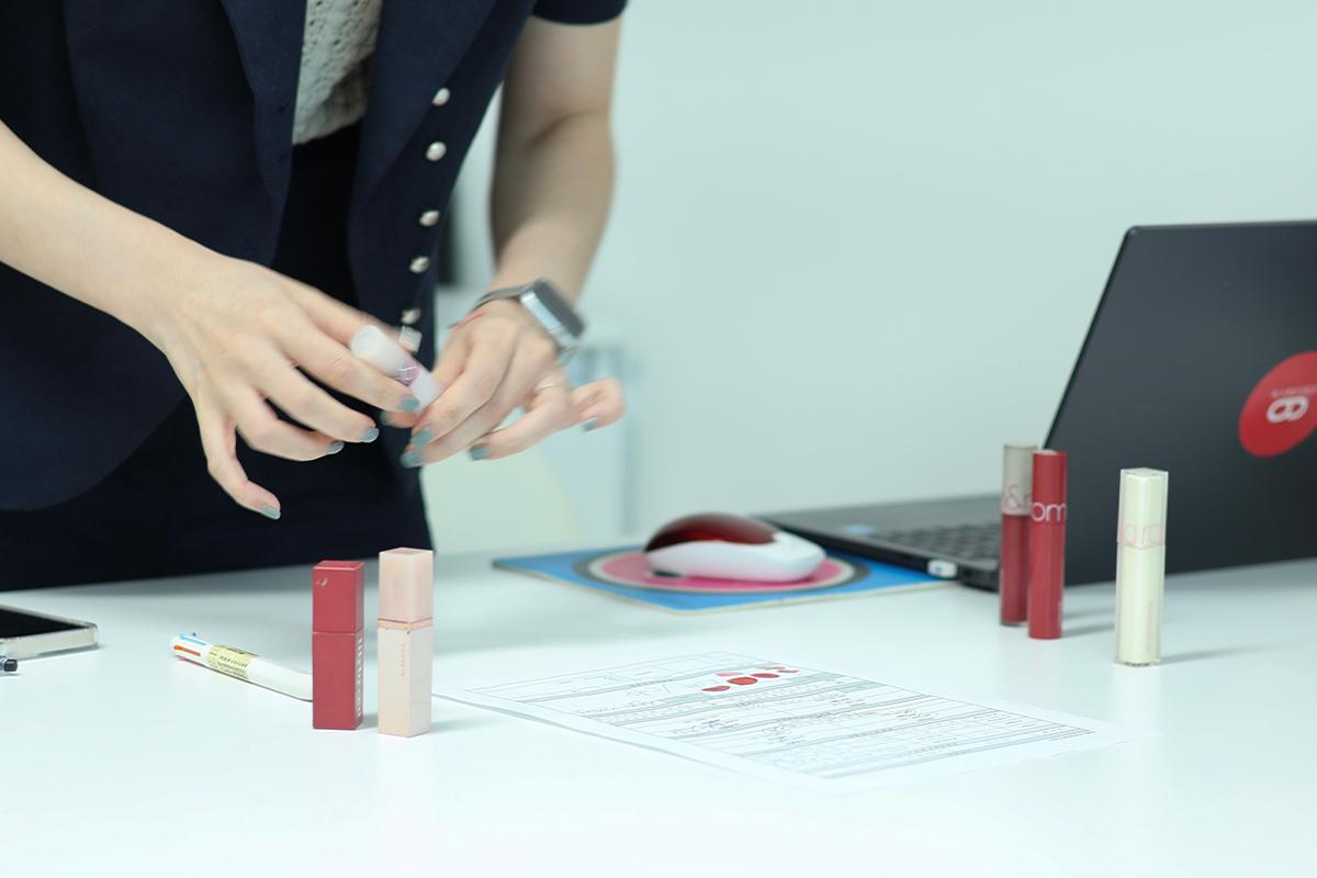
I tried out various cosmetics on paper to see the actual shades. While some were spot-on, others, particularly some lipsticks, were overly dark and unflattering. I doubt I'll be reaching for those products again.
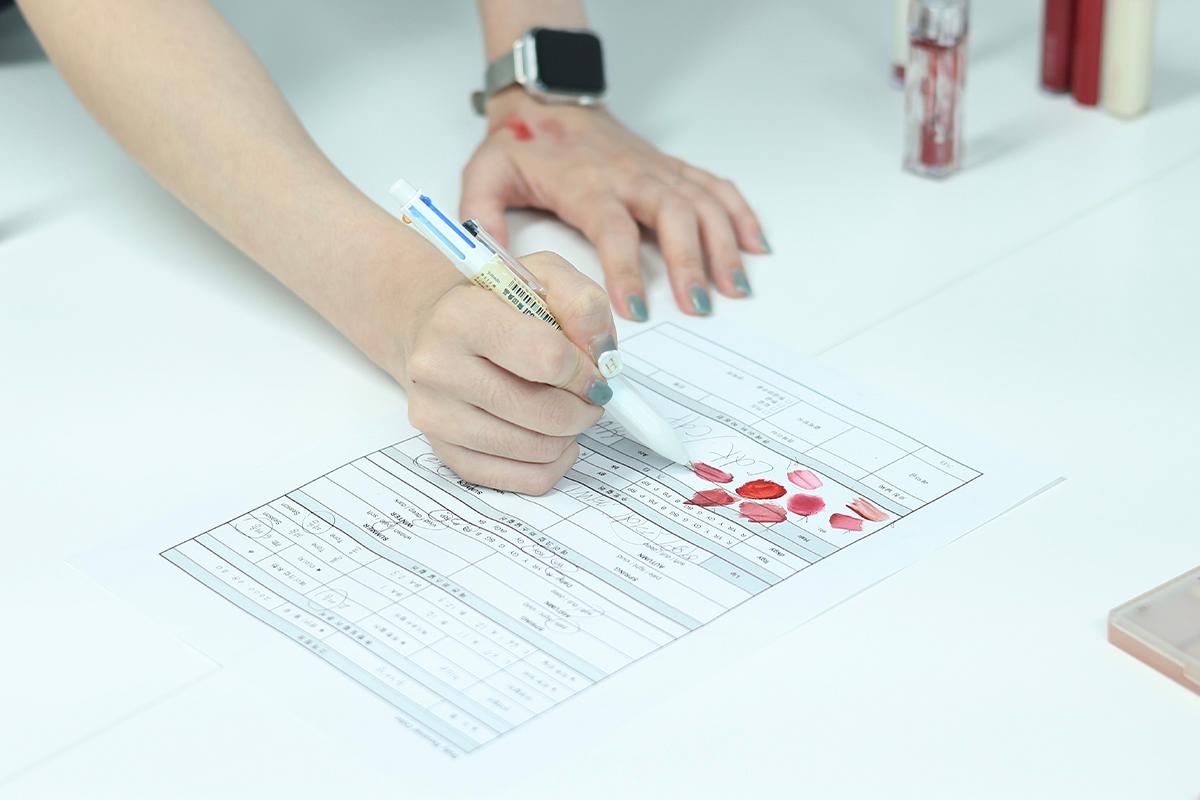
Having each finding laid out and explained on a chart proved immensely helpful for future cosmetic shopping. Given my penchant for colors suited more to warm tones, it looks like I'll be embracing quite a change!
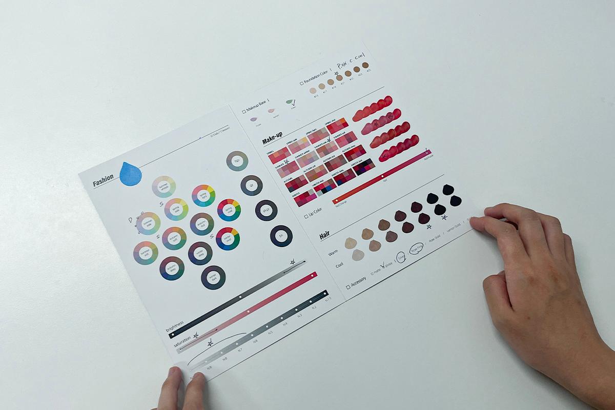
Post-diagnosis, I received well-organized, clear, and easy-to-read materials — a detailed overview of my personal color analysis.
What's more, they offered additional recommendations tailored to my colors, available as photo materials. I appreciate being able to shop with these references in hand, ensuring I select the right colors without needing to carry paper.
My personal color diagnosis journey was both educational and immensely beneficial. The detailed understanding I gained, coupled with the convenience of language interpretation, made the entire process seamless. I firmly believe a one-time personal color analysis is invaluable. So, if you're in Hongdae, I highly recommend visiting the Cocory Personal Color Research Institute!